User Experience | Web Design | Graphic DesignCancer Immunologic Data Center
CIDC is a centralized platform that collects and analyzes data from different clinical trials. My team inherited the application from another company. One of the goals of the redesign of this application was to apply the styles of the US Web Design System. In addition to new styles, the entire application was scrutinized in search for layout and usability improvements. Huge amounts of complex information needed to be searchable and understandable. All data in the screenshots is simulated and some is blurred for extra security.
-
The Problem
The CIDC application had poor usability, overwhelming data presentation, and accessibility issues that made it difficult for researchers to interpret complex clinical trial information. The interface relied on color-coded data that wasn’t accessible to users with visual impairments, and forms were long and confusing.
-
The Solution
The redesign applied the U.S. Web Design System to modernize the interface, ensuring accessibility and clarity. Data visualization and forms were simplified, workflows were streamlined, and charts were redesigned with labeled markers and improved color contrast for inclusivity.
-
My role: UX Designer
Client: National Cancer Institute
Tools: Figma, Adobe Creative Suite
Design System: US Web Design System
Deliverables: user flows, wireframes, high-fidelity prototypes, sitemaps, UI design, design specs for development
The CIDC homepage features the main statistics of the project. The big picture. This tells researchers the impact their work is having on the bigger scientific community. It also gives them immediate access, after logging in, to the areas the user most frequently needs.
Old Homepage
When lots of data is presented, it is important to have some of the data hidden as not to overwhelm, the user with information. At the same time, the user has to have easy ways to search, filter and sort to get the information he/she is looking for.

Old Data View Page
Forms are a big component in biotechnology applications. Forms need to simplify the upload of very complex data. This is achieved by breaking up long forms into separate steps with clear guidance along the way.
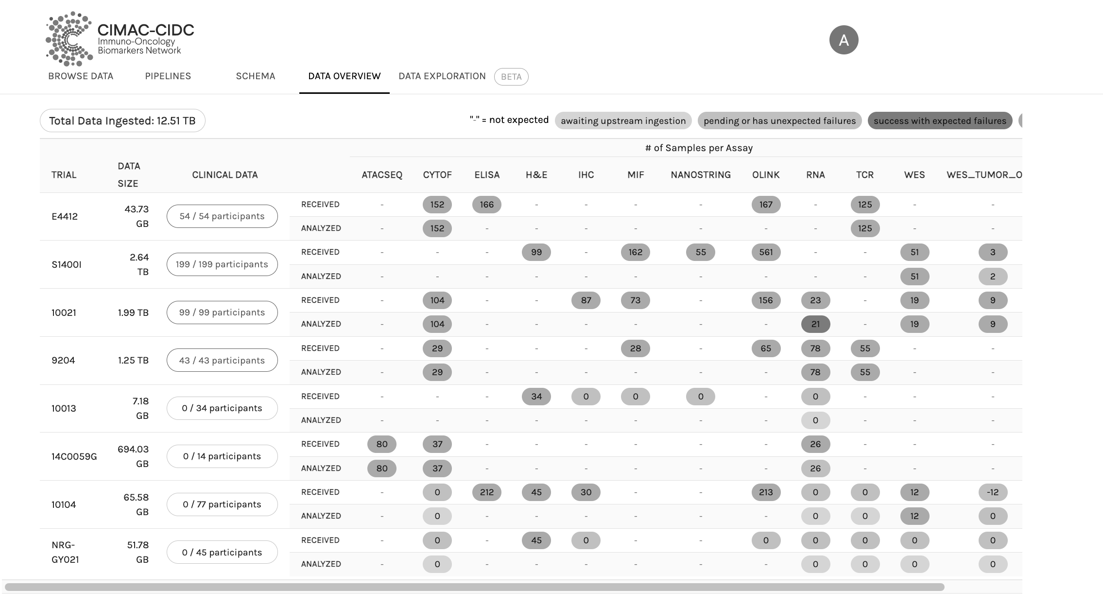
Old CIDC chart before redesign
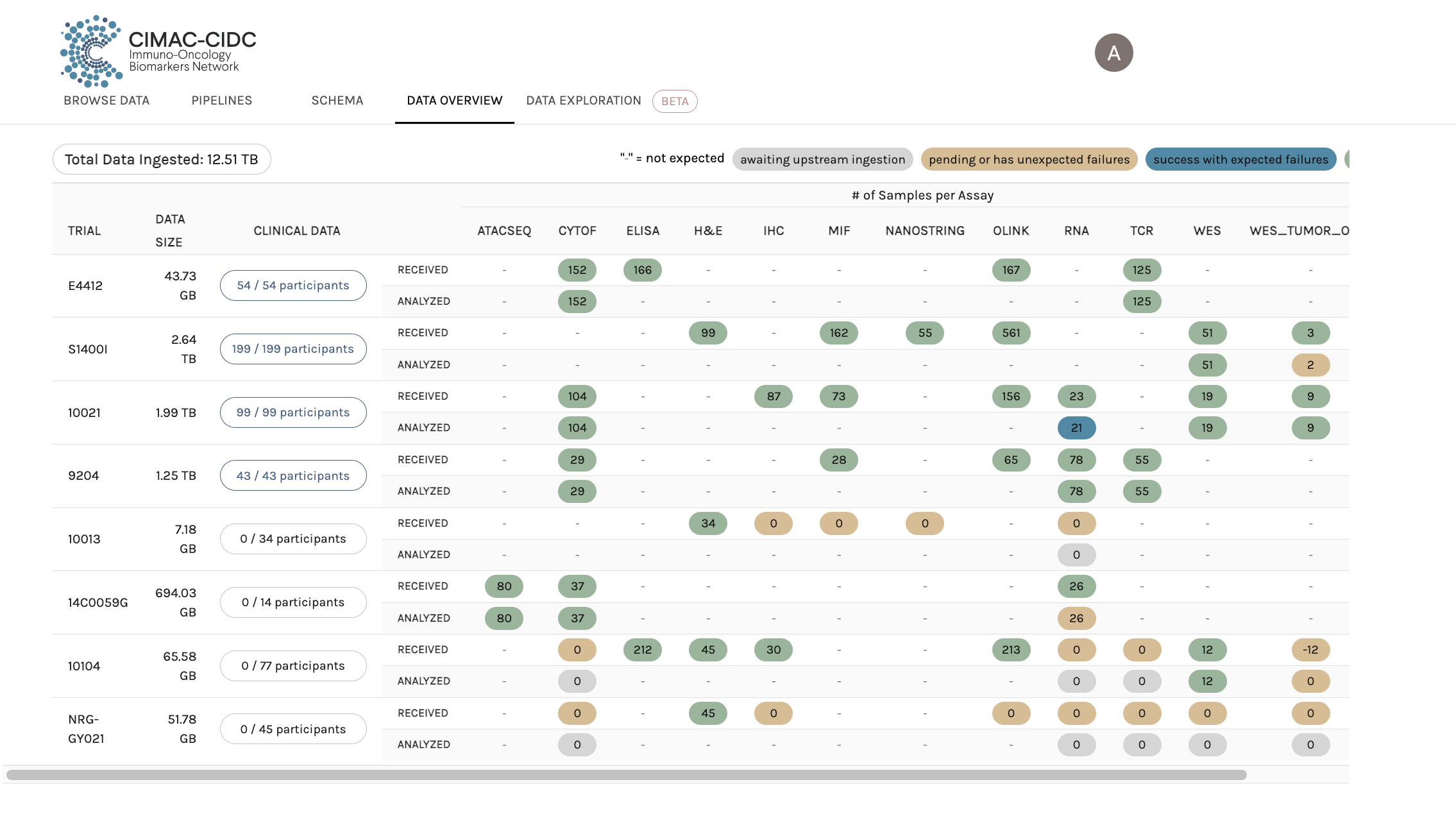
Redesigned Chart
An important part of the application is a chart that visually compares different trials. The existing chart had usability and accessibility issues that had to be fixed. The information was condensed to avoid vertical scrolling. For accessibility reasons, information cannot be solely communicated through color. That is why the color bubbles in the old application were changed to include a letter. Colors were adjusted to fit the USWDS and increase color contrast.
Tests for Color Blindness Accessibility
As a designer, many times you get pushback when you suggest major changes that require a lot of development hours. Many tests using color blindness simulators were performed to demonstrate the need for the changes suggested.
Due to the sensitivity of the project and strict privacy concerns, the design results and application details cannot be published or publicly shared.
I am currently available for work and looking forward to hearing from you.
If you have any questions or would like to set up an interview, send me an email at aynex21@gmail.com. Connect with me on Linked In.